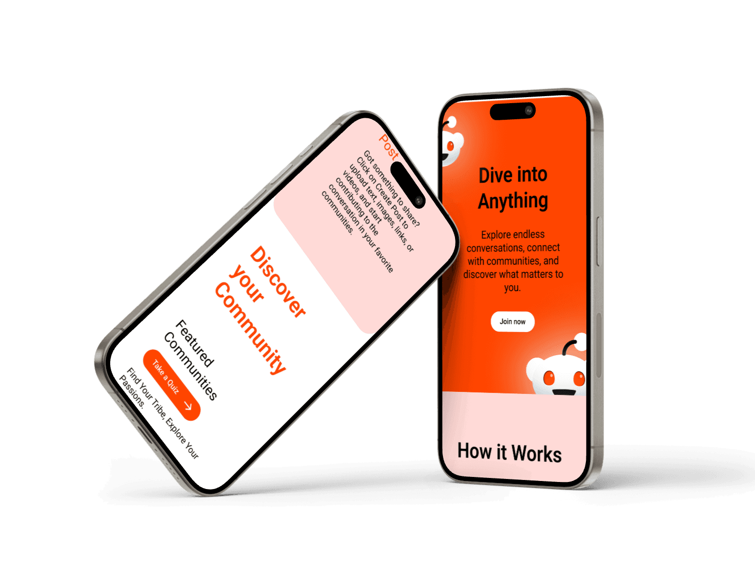
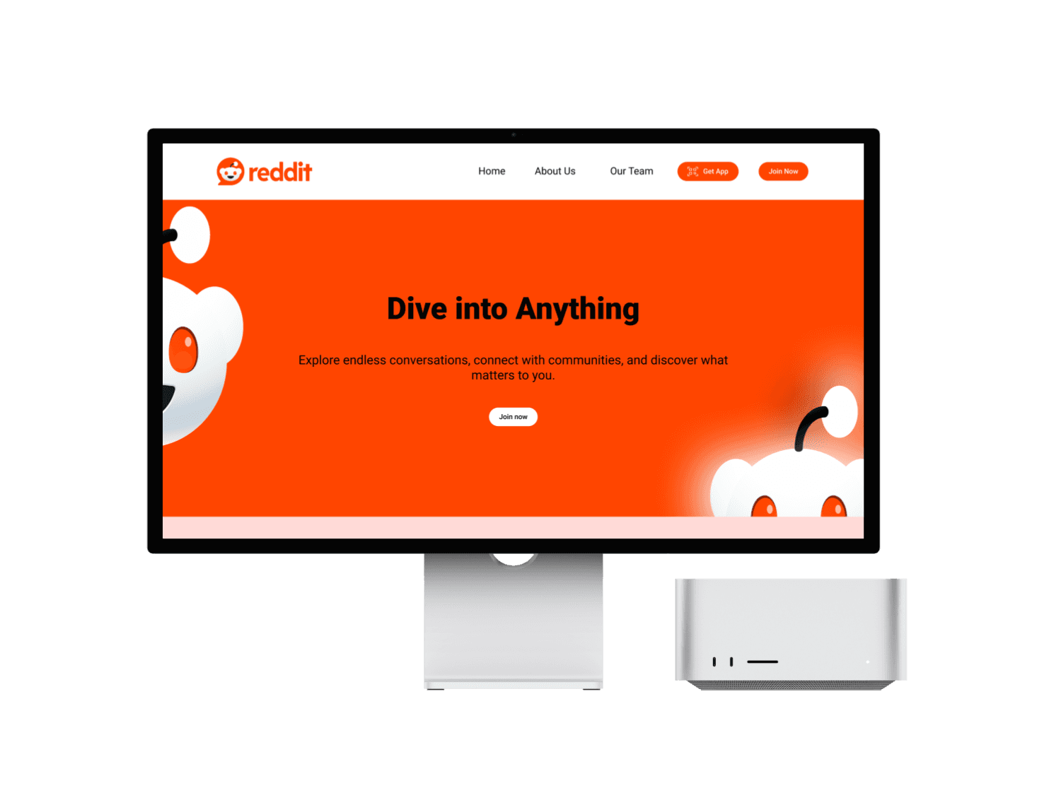
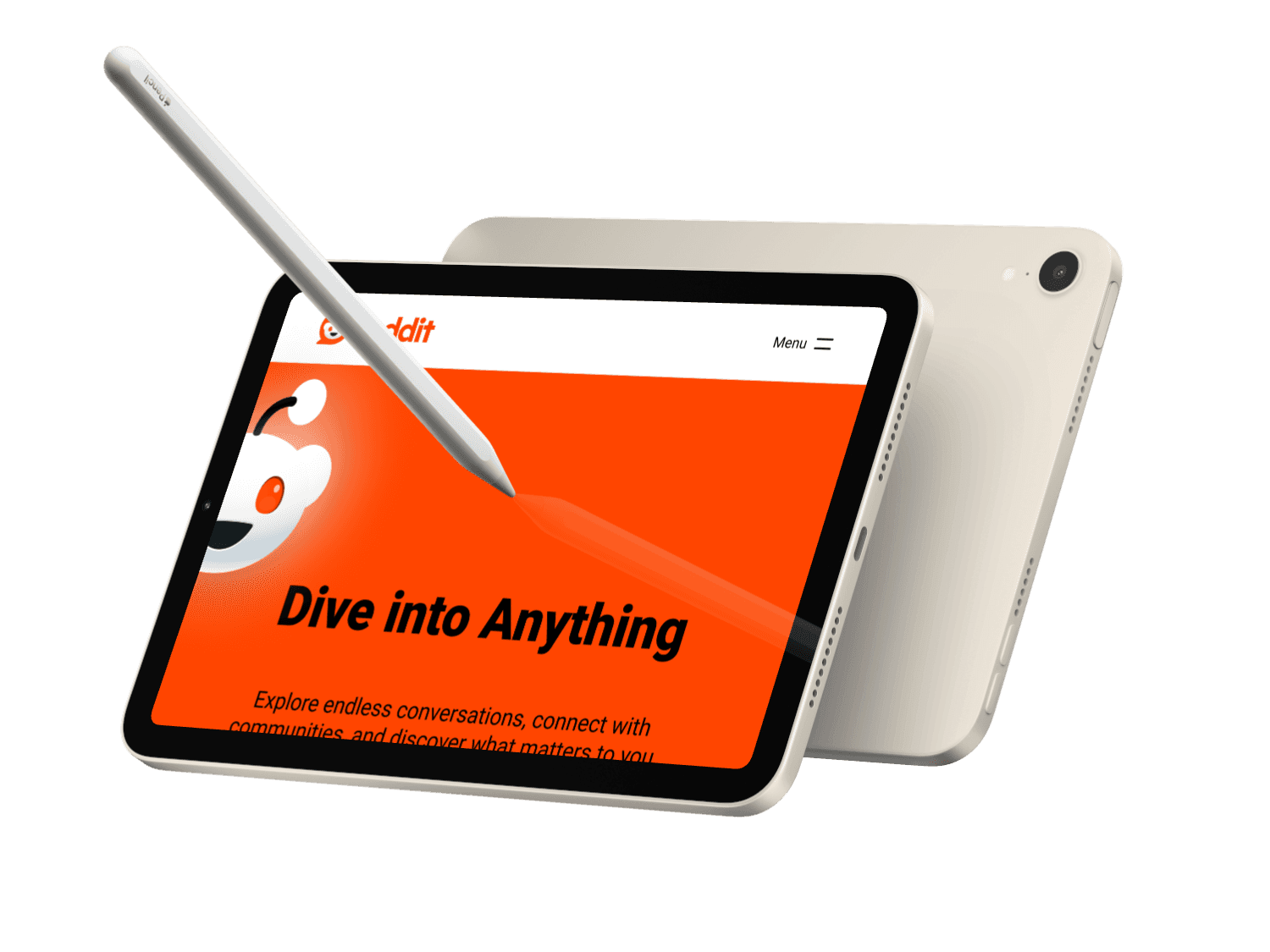
Reddit is a leading community-driven platform where millions engage daily. While its functionality is powerful, the existing landing page could be optimized for clarity, appeal, and user onboarding. This project is a voluntary redesign of Reddit's landing page aimed at enhancing user experience and modernizing its UI.
The current landing page is functional but presents several challenges:
Overwhelming layout for first-time visitors.
Visual clutter due to dense content and lack of hierarchy.
Limited call-to-action focus, making user onboarding less intuitive.
Outdated UI that does not fully align with modern design trends.
I identified that Reddit does not have a dedicated landing page, instead it directly leads to the feeds page. It’s functional
Overwhelming layout for first-time visitors.
Visual clutter due to dense content and lack of hierarchy.
Limited call-to-action focus, making user onboarding less intuitive.
Outdated UI that does not fully align with modern design trends.
I conducted research to understand the key areas for improvement:
User Pain Points: Analyzed user feedback and online forums highlighting common frustrations with navigation and onboarding.
Competitor Benchmarking: Reviewed the landing pages of similar platforms like Twitter, Discord, and Quora to identify trends in usability and layout.
Key Findings: Users value simplicity, engaging visuals, and a clear pathway to signing up or exploring features.
Based on my research, I brainstormed potential solutions:
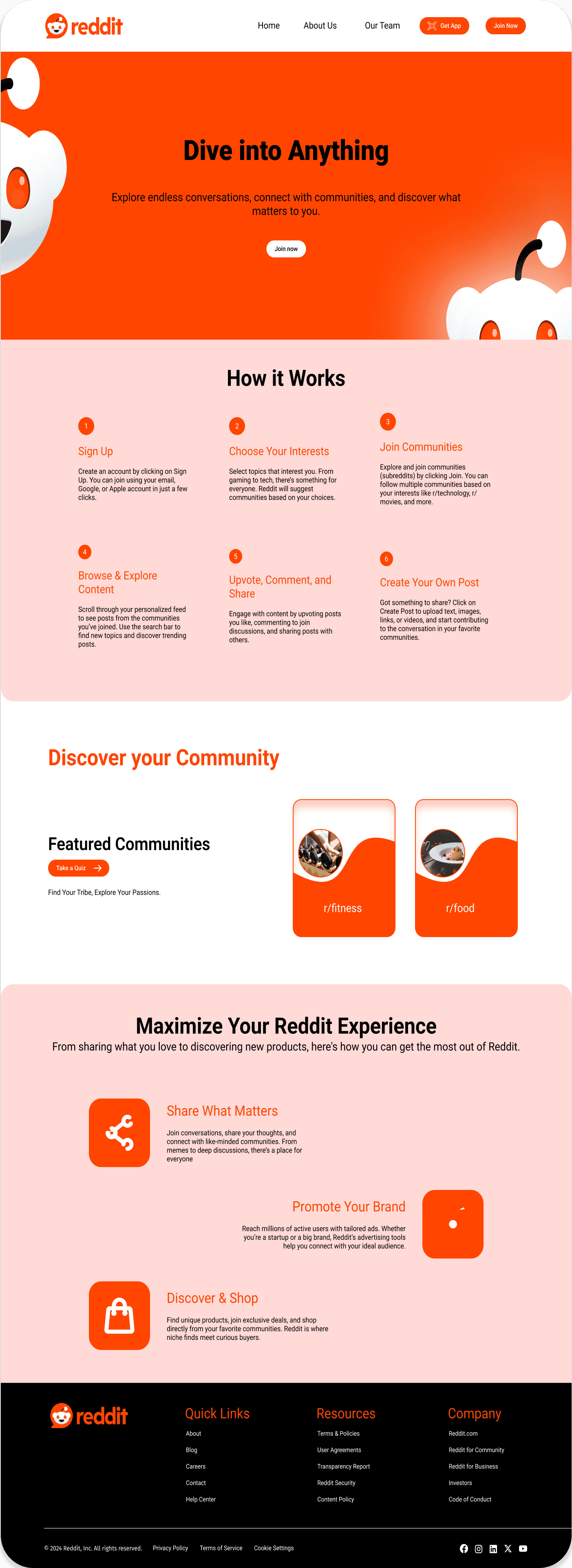
A streamlined hero section featuring Reddit’s unique value proposition.
Clear segmentation of content, such as trending communities and benefits of joining Reddit.
Enhanced call-to-action placement for sign-ups and app downloads.
A modern, clean, and responsive design that aligns with Reddit’s branding.
I began by sketching low-fidelity wireframes to experiment with layout ideas.
Focused on creating a clear structure that prioritizes important elements like the hero section and CTAs.
Designed wireframes for desktop and mobile views to ensure responsiveness.
Using the wireframes as a foundation, I created high-fidelity designs in Figma:
Color Scheme: Retained Reddit’s signature orange for brand consistency while introducing neutral tones for balance.
Typography: Chose clean, readable fonts to enhance visual hierarchy and accessibility.
Imagery: Added community-themed illustrations to highlight the platform’s diverse user base.
Interactive Elements: Designed buttons with hover effects and transitions to improve engagement.
I reviewed the final design for:
Consistency: Ensured alignment of colors, fonts, and spacing.
Functionality: Verified that CTAs are prominent and intuitive for users.
Usability: Double-checked the layout for responsiveness and accessibility across devices.
After completing the design, I reviewed the case study to ensure it was aligned with the goals I set. The final design was ready to be handed off for development, complete with annotations for seamless implementation.
Clear Value Proposition: Users need to instantly understand Reddit's purpose and why it’s beneficial to join.
Simplified Navigation: Visitors require an intuitive structure that highlights key actions like signing up or exploring communities.
Strong Calls-to-Action: Clear and visually prominent CTAs (e.g., “Join Now” or “Download the App”) are essential for guiding users.
Engaging Visuals: Users appreciate vibrant and community-focused imagery that reflects Reddit's culture and diversity.
Responsive Design: The landing page must provide a seamless experience across all devices, ensuring accessibility and ease of use.


